- Products
- Email Verifier Verify emails addresses individually, in bulk or through API, with 99% accuracy
- Email Finder Find individual or bulk emails by entering the person & company name or domain
-
Form Guard Protect your forms from spam, bots, and invalid submissions with real-time email, phone, and name verification.
- Prospect SQL/MQL list building with high levels of personalization, real-time data enrichment and prospect search
- Clearout For SheetsVerify email addresses directly on Google Sheets with Clearout for sheets add-on
- Prospect – LinkedIn Chrome ExtensionBuild verified, targeted prospect lists directly from LinkedIn profiles
- ClearoutPhoneValidate phone numbers across 240+ countries in bulk, quick or real time validation Free Tools
- Disposable Email Checker
- Reverse LinkedIn Profile Lookup Tool
- Reverse Email Lookup Tool
- Email List Cleaner
- Company Domain Finder API
- ResourcesDEVELOPER
API
Clearout APIs are structured around REST and JSONWebhooks
Capture real-time events in your application workflowForm Guard
Real-time form validation to keep bad contacts out of your CRMKNOWLEDGE BASEGetting started
Sending campaigns without bounces is made simpleFAQ
Easily find answers to services, security and common questionsUSE CASESLead Generation
Learn how professionals generate quality leadsGUIDESPricingTransparent & flexible pricing to support pay-per-use or recurringCompare Email Verification Tools
AI-powered email verification with 99%+ accuracy, real-time validation, and transparent risk scoringCompare Email Finder Tools
Pre-verified B2B email addresses with confidence scoring, find real person email, not role-based addressBLOGSEmail Verification ToolsFind Anyone’s Email Address
Most Accurate, Fast & Free WaysForm Validation
Importance, Ways & Best PracticesView All Blogs - Pricing
- Integrations
- Enterprise
- Login
Designing User-friendly Form Error Messages (Best Practices + Examples)

We all would surely agree that the below error message looks complete gibberish to us.
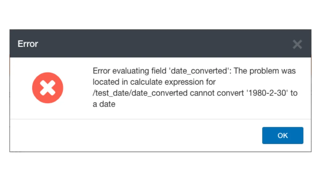
How is a user expected to understand such cryptic messages and what error they made while filling out the form? The answer is they won't.
In most cases, they'd simply abandon the form in frustration.
This is exactly why you must pay attention to your form design and error messages.
Forms with security concerns, unnecessary questions, and unclear instructions are major reasons for a high form abandonment rate.
Even a well-designed form can suffer bounces if the error messages are confusing or unhelpful.
There's only one simple solution: creating precise and informative form error messages that actually guide users and don't scare them away. In this blog post, we'll explore the importance of form error messages and provide actionable tips to help you craft better error messages.
Table of Contents:
Importance of Form Error Messages
Form error messages play a crucial role in ensuring a smooth and frustration-free experience for users filling out any online form. Here's why they are important:
1. Enhancing User Experience:
Error messages in web forms are not just a technical necessity; they serve a much larger purpose in enhancing user experience.
Clear and constructive error messages help users correct their mistakes and complete forms more efficiently. This interaction is crucial because it communicates to users that their experience is valued and that assistance is readily available to guide them through problems.
For instance, instead of a generic error such as "Invalid entry," a more helpful version would be, "Please enter your phone number in the format: 123-456-7890."
This not only tells users what the issue is but also how to fix it.
Hence, detailed and user-friendly error messages prevent frustration and ensure that users feel supported throughout their interaction with your website, encouraging continued engagement.
2. Increased form completion rates:
Think about the last time you hit a confusing error message on a form. Did you stick around to figure it out, or did you just give up? Most people give up. When an error makes no sense, leaving feels easier than troubleshooting it. That is a real problem, because every drop-off is a potential lead or customer you have lost. The good news is simple: fix your error messages and more people will finish your forms.
It sounds almost too simple, but just naming the field changes everything. "Your email address is required to proceed" takes five extra words and suddenly the user knows exactly what to fix and why. No re-reading, no frustration, no abandoned form. The numbers back this up too: inline validation reduces form errors by 22% on average and helps users complete forms 42% faster. All from being a little more specific.
It sounds almost too simple, but just naming the field changes everything. "Your email address is required to proceed" takes five extra words and suddenly the user knows exactly what to fix and why. No re-reading, no frustration, no abandoned form. The numbers back this up too: inline validation reduces form errors by 22% on average and helps users complete forms 42% faster. All from being a little more specific.
3. Better data quality:
Error messages act as a safety net by catching incorrect data entries before they are submitted.
This ensures that you receive more accurate and usable information through the forms. In many cases, forms are used to collect sensitive data, such as credit card numbers or personal information. Inaccurate data entries can lead to a variety of problems, such as failed transactions, wasted time spent correcting errors, and even security breaches.
For example, if you're only accepting submissions from business email addresses, your error message should say: "Please use your business email address. Personal emails like Gmail or Yahoo aren't accepted here." This removes guesswork and keeps your pipeline clean.
Common Form Error Message Mistakes to Avoid
When designing error messages for web forms, it’s important to avoid common pitfalls that could detract from the user experience or confuse users. Here are some widespread mistakes to steer clear of:
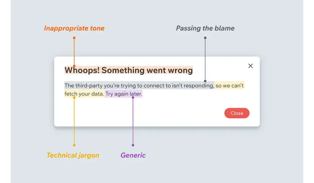
1. Vague Messaging: Avoid unclear messages like "Error occurred" or "Invalid input." Such messages fail to inform the user about what specifically went wrong or how to fix it.
2. Technical Jargon: Users may not understand technical terms or coding language. Keep the language simple and user-friendly. For instance, replace "403 Forbidden" with "You don’t have permission to access this section."
3. Blaming the User: Phrasing errors in a way that might seem accusatory can alienate users. Instead of "You entered the wrong date," a better approach could be "The date format should be MM/DD/YYYY."
4. Overwhelming Users with Information: While providing information is good, too much information can be overwhelming. Keep error messages concise and to the point.
5. Lack of Visual Support: Often, text alone might not be enough to direct the user’s attention to the error. Use color, icons, or pointers to clearly indicate where the issue lies.
6. Inconsistency: Inconsistent error messages can confuse users and seem unprofessional. Maintain a uniform style and tone in all messages across your forms.
By avoiding these common mistakes, you can create error messages that are not only more helpful but also contribute positively to the overall user experience and effectiveness of your web forms.
Best Practices for Writing Form Error Messages
Now, let’s have a look at the practices that can help you create user-friendly forms error messages:
1. Identify the Error Type & Craft Specific Messages
First, pinpoint the exact issue with the user's input. And then craft relevant messages for each type of error. Some of the common errors include:
- Missing Field: "Looks like you missed filling out the 'Name' field. Please enter your name."
- Invalid Format: "The email address you entered seems to be invalid. Please double-check and enter a valid email address."
- Incorrect Data Type: "We only accept numbers in the 'Phone Number' field. Please remove any letters or special characters."
- Value Exceeds Limit: "The password must be between 8 and 15 characters. Please try again with a password that meets this requirement."
2. Consider In-line Validation
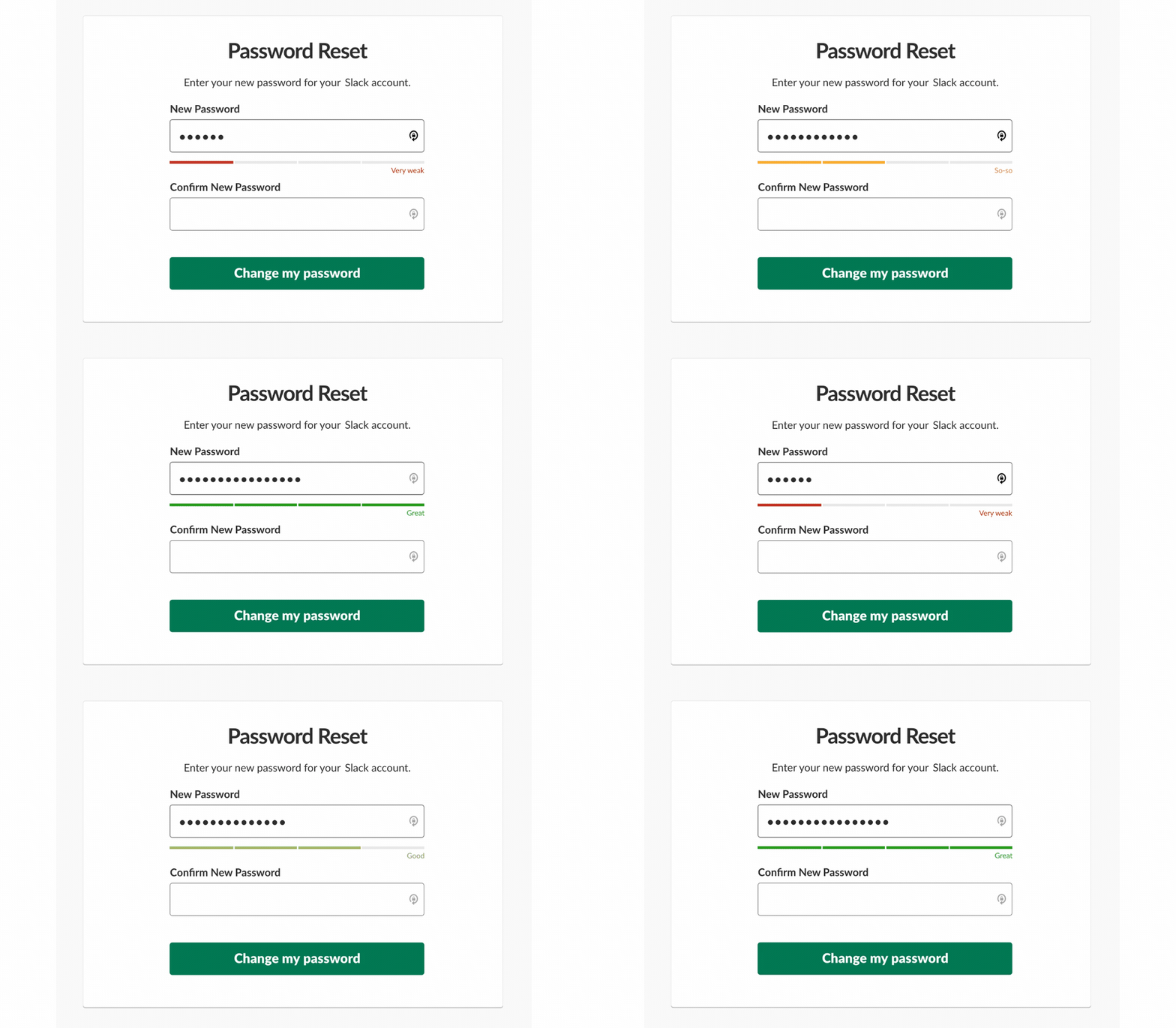
Filling out a form and only finding mistakes at the end slows people down and causes frustration.
Inline validation fixes this by checking each field as the user fills it. Errors are caught and corrected instantly, so nothing piles up. The process becomes faster, smoother, and easier to complete.
A password strength meter is a great example of this done right. Instead of waiting for a user to submit and then telling them their password is too weak, you guide them in real time the indicator shifts from red to green as they build a stronger password. Same idea for email fields: you can validate format as they type, or go a step further and confirm the address is actually real and deliverable before the form ever gets submitted.
That's where Clearout Form Guard comes in handy. It can be integrated with any form to check submission detailed like emails, phone numbers, and names as users fill them. It checks whether the email actually exists, whether it's a gibberish name, and if the phone number is reachable. It also includes smart bot protection using proven CAPTCHA methods, so automated spam entries never make it through.
Beyond validation, Form Guard enriches every contact with carrier, location, and deliverability data at the point of capture. Form Guard also gives you real-time visibility into incomplete submissions, so you can identify where users dropped off and recover leads you would have otherwise lost entirely.
3. Maintain a Positive Tone
The tone of your error messages can affect how users perceive your website.
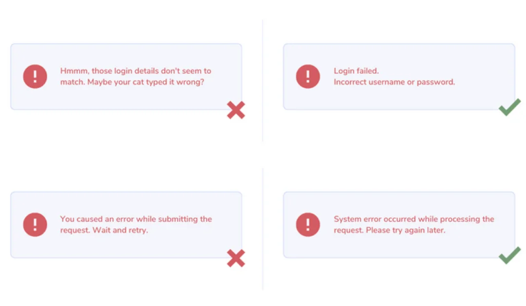
Avoid making users feel like they did something wrong. Instead, use friendly and supportive language to maintain a positive user experience. For example,
"Looks like you missed your ZIP code. Could you please add it?" feels much less accusatory and more cooperative than a blunt message like “Error: ZIP code missing.
"We noticed..." or "There seems to be a small issue..." is better than "Error!" or "Invalid Input!"
"Looks like you missed your ZIP code. Could you please add it?" feels much less accusatory and more cooperative than a blunt message like “Error: ZIP code missing.
"We noticed..." or "There seems to be a small issue..." is better than "Error!" or "Invalid Input!"
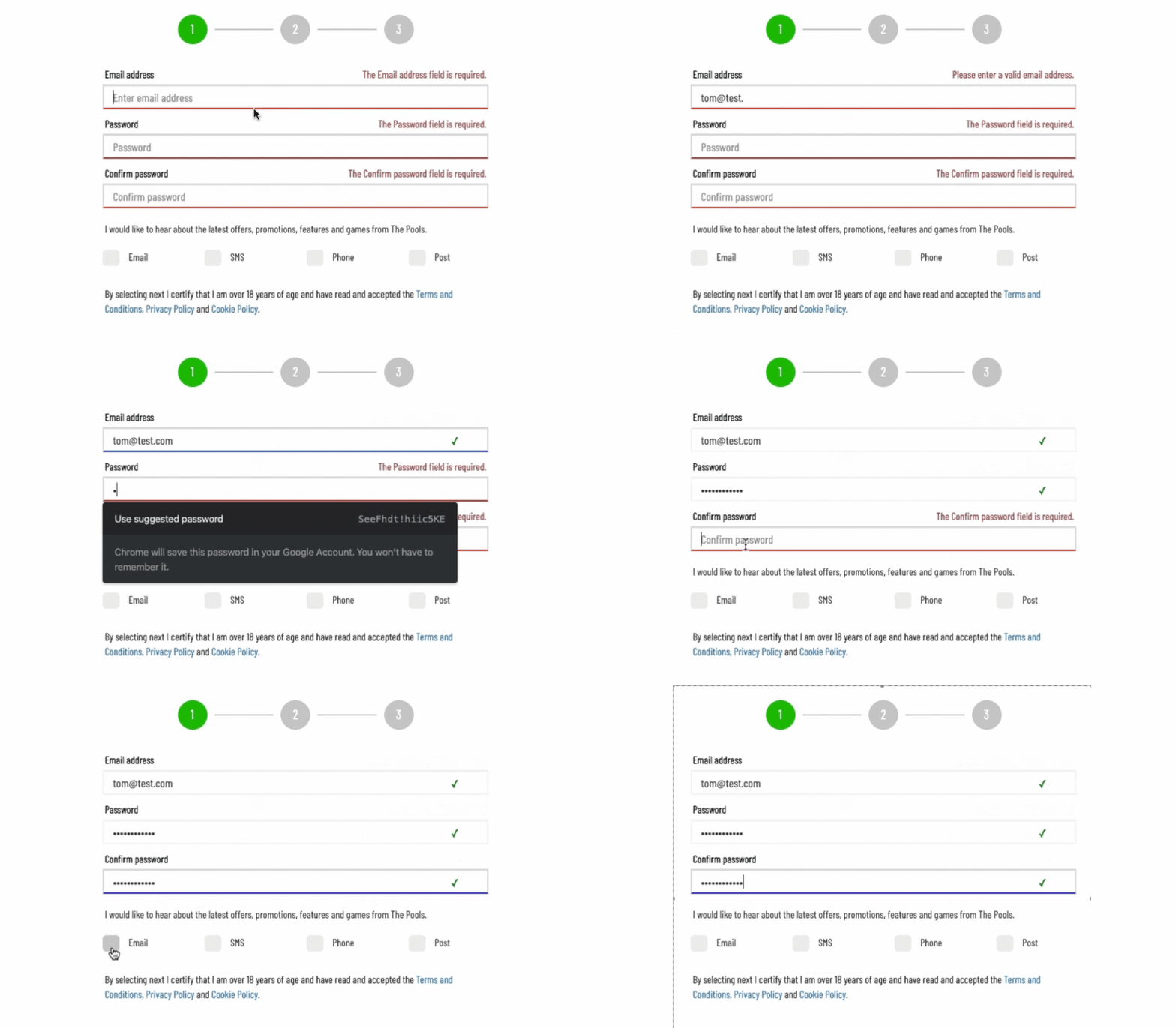
4. Add Visual Cues
Making error messages visually distinct is crucial for grabbing the user's attention and directing them to the issue quickly. Here are some ways to achieve this:
- Color: Red is the most universally recognized color for errors. Use a slightly lighter shade of red for the border of the error field and a slightly darker shade for the error message itself. This creates a clear distinction between the regular form field and text.
- Icons: Universally understood icons can add another layer of clarity. You can use a red exclamation mark ❗for errors and a green tick ✅ for correct inputs. Consider using it next to the error message or within the error field itself.
- Underline: A subtle red underline can also be used to highlight the error field, particularly for text-heavy forms where color might overwhelm the design.
- Bold Text: While not as strong as color, bolding the error message can make it stand out from the surrounding text.
5. Test and Refine
Get real users to test your form and error messages. This will help you identify any confusing wording or areas where the message can be improved for clarity. You can try conducting:
- Usability Testing: Observe real users as they interact with your form. Note where they struggle and how they respond to error messages.
- A/B Testing: Test different versions of error messages to see which ones lead to higher completion rates and lower abandonment.
- Analyzing Support Queries: Review customer support tickets to identify common issues related to form errors.
- Monitor Error Frequency: Identify which errors are most common and prioritize improving those messages.
Form Error Message Examples & Scenarios To Learn From
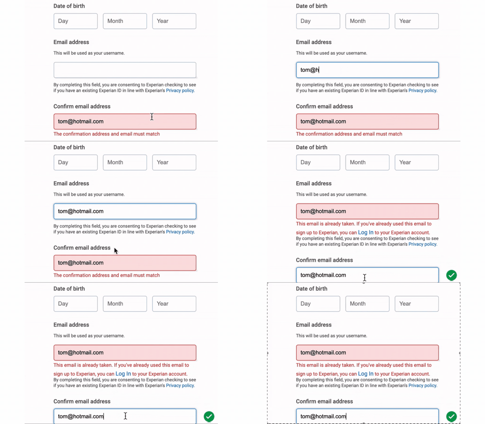
Scenario 1: Invalid Email Address
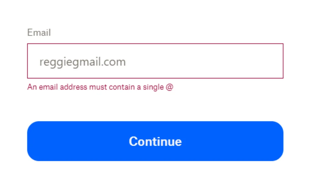
✔️Why It's Better:
The message is specific and points out what exactly is missing in the email, instead of a plain invalid input, helping users understand what is expected
The message is specific and points out what exactly is missing in the email, instead of a plain invalid input, helping users understand what is expected
Scenario 2: Password Requirements Not Met
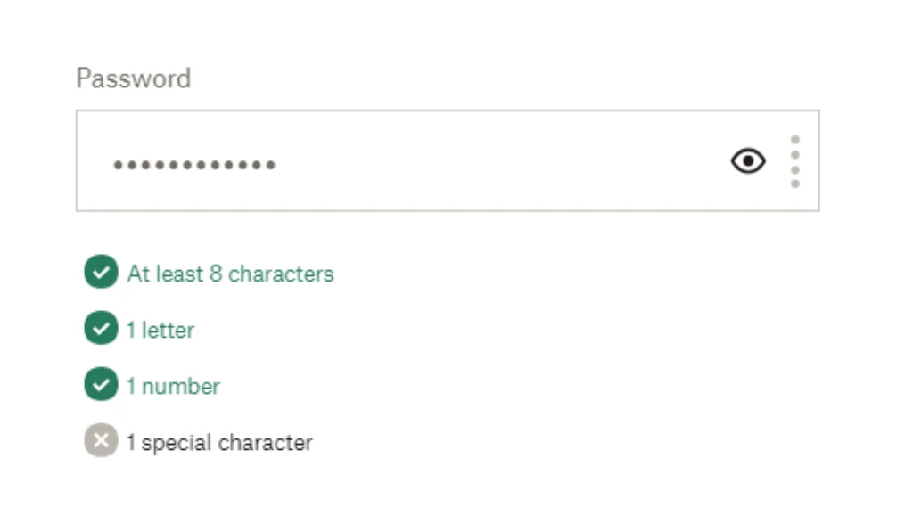
✔️Why It's Better:
This is one of the best ways to help users understand the password requirements and check if they are doing it right while typing in.
This is one of the best ways to help users understand the password requirements and check if they are doing it right while typing in.
Scenario 3: Empty Required Field
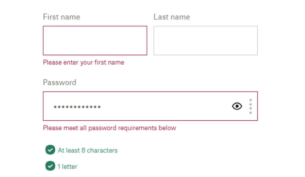
✔️Why It's Better:
The message uses polite and friendly language to tell them what is needed, making the user experience more positive.
The message uses polite and friendly language to tell them what is needed, making the user experience more positive.
Scenario 4: Mismatched Passwords
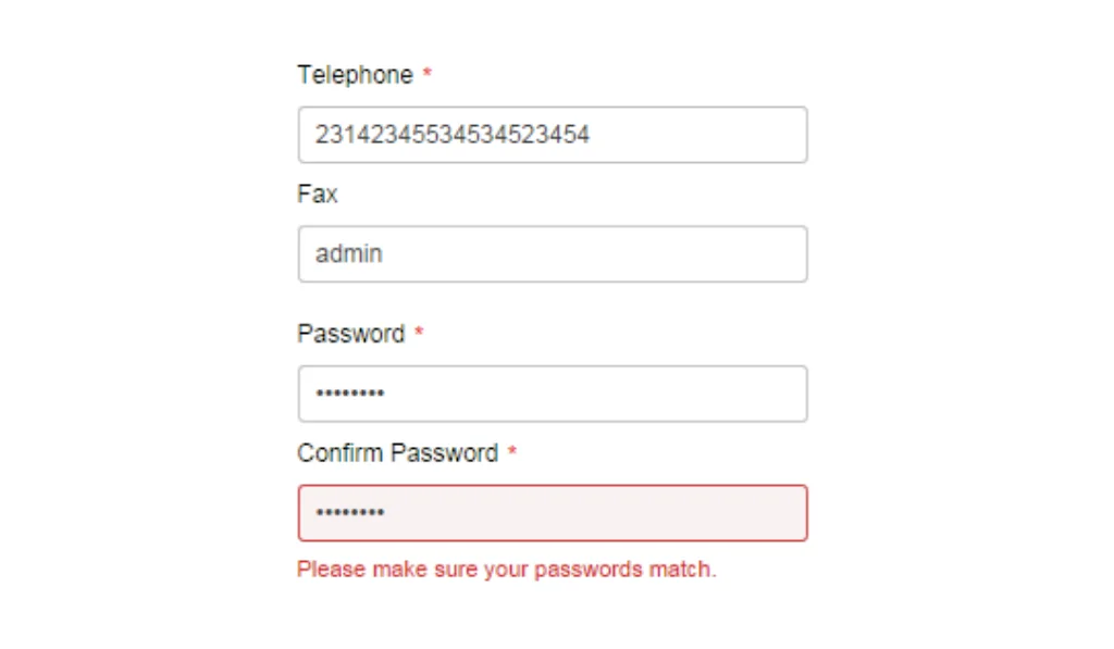
✔️Why It's Better:
The message is friendly and tells that both the passwords do not match and they should retry. Otherwise, just showing errors, or checking your password can sometimes result in users trying multiple different passwords without really understanding what they need to fix.
The message is friendly and tells that both the passwords do not match and they should retry. Otherwise, just showing errors, or checking your password can sometimes result in users trying multiple different passwords without really understanding what they need to fix.
Scenario 5: Payment Failure
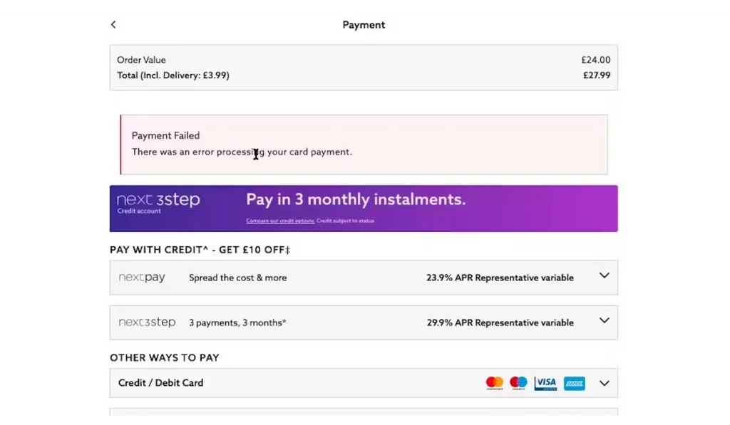
✔️Why It's Better:
Payment error messages are very important, as it needs to be clear to the user what has happened. If the card used is not accepted, there has been a processing error, the details don’t match, etc. So, instead of just saying payment declined, make sure to add the reason and stop users from bouncing back.
Payment error messages are very important, as it needs to be clear to the user what has happened. If the card used is not accepted, there has been a processing error, the details don’t match, etc. So, instead of just saying payment declined, make sure to add the reason and stop users from bouncing back.
Scenario 6: Fake or Disposable Email Address
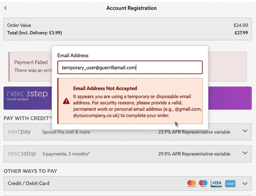
✔️Why It's Better:
"Email not accepted" gives users nothing to work with. Are they being blocked? Did they make a typo? Is it a technical issue? They have no idea. A well-written message is direct without being harsh: it tells the user what is wrong, what to try instead, and keeps the tone friendly enough that a genuine user does not feel penalised. If you are using Clearout Form Guard to catch throwaway or invalid addresses, this is the kind of message it deserves alongside it.
"Email not accepted" gives users nothing to work with. Are they being blocked? Did they make a typo? Is it a technical issue? They have no idea. A well-written message is direct without being harsh: it tells the user what is wrong, what to try instead, and keeps the tone friendly enough that a genuine user does not feel penalised. If you are using Clearout Form Guard to catch throwaway or invalid addresses, this is the kind of message it deserves alongside it.
Stop Bad Data Before It Even Reaches You
Even the best-written error message can only help users who are genuinely trying to fill in the form correctly. It cannot do much about someone deliberately entering a fake email, or a typo that passes basic format checks but bounces the moment you hit send. That is a separate problem, and it needs a separate solution.
Clearout Form Guard works in your web forms to check inputs in real time before anything gets submitted. So instead of dealing with bad data, you are stopping it before it ever enters your system.
Here's what it keeps an eye on:
Clearout Form Guard works in your web forms to check inputs in real time before anything gets submitted. So instead of dealing with bad data, you are stopping it before it ever enters your system.
Here's what it keeps an eye on:
- Email addresses: Spots typos, flags disposable or temporary inboxes, and catches role-based addresses like info@ or admin@ that rarely is useful anywhere .
- Phone numbers: Checks that the format is right and the number is actually active and reachable.
- Names: Picks up on obviously fake entries like "test test" or typo names before they enter your CRM.
- Real-time feedback: Users know instantly if their details needs fixing as they type, rather than finding out after they've submitted.
- Fake signup prevention: Keeps bots, spam entries, and low-quality leads out of your CRM from the start.
Helping Users with Form Validation Error Messages
Well-crafted form validation error messages are the difference between a frustrating roadblock and a smooth user experience.
When crafting error messages, always put yourself in the user's shoes. and ask yourself what information would help you understand and resolve the issue quickly and comfortably. This way you can help to quickly fix mistakes and successfully complete your forms.
💡 Here's a pro tip: Use form validation tools like Form Guard to provide real-time feedback as users type. It catches errors, bot submissions, typos, and invalid contact details.
FAQs
1. How can I stop fake or invalid emails from being submitted to my form?
A standard format check only confirms there is an "@" symbol present. It has no way of knowing whether the address is real, active, or made up on the spot. Clearout Form Guard goes further by catching disposable addresses, typos, and invalid domains as the user types, so junk data never reaches your database in the first place.
2. What's the best colour to use for form error messages?
Red is the go-to, people instinctively associate it with "something's wrong" but don't lean on colour alone. Pair it with an icon like❗ so users who are colour-blind or on low-contrast screens can still catch the error without any guesswork.
3. Should I show all form errors at once or one at a time?
On a short form, showing everything at once after Submit is totally fine as there isn't much to fix anyway. On longer forms, flagging errors field by field as users progress is far more considerate. Nobody wants to reach the end of a form only to be handed a full list of things to redo from the start.
4. Do form error messages affect conversion rates?
Yes, and the effect is more significant than most people expect. One unclear error message at the wrong moment and the user is gone, with no complaint and no explanation. Get the messaging right and more people will complete the form, which reflects directly in your lead volume.
Recent Posts
07 May 2026
Top 6 GTM Mistakes That Slow Down Your Revenue
Discover the top 6 common go-to-market mistakes that slow down your revenue and learn proven strateg ...
30 Apr 2026
7 Cold Email Frameworks That Work in 2026 (With Examples)
Explore the 7 cold email frameworks for 2026 with real examples. Learn when to use AIDA, PAS, BAB, a ...
29 Apr 2026
15 Go-To-Market Tools Every B2B Team Needs (By Category)
Explore 15 go-to-market tools for B2B teams, grouped by category. Compare CRM, data quality, outboun ...
27 Apr 2026
9 Common Misconceptions About Finding Email Addresses
Discover the 9 common misconceptions about finding email addresses and learn the reality behind them ...
24 Apr 2026
Email Warmup Checklist for New Domains (2026 Guide)
Got a new email domain? Use this email warmup checklist to improve deliverability, avoid spam folder ...
Clearout's
Form Guard
Validate email, phone & name on any forms!
- Real signups only
- Verified emails
- Valid phone numbers
- No fake names
- Cleaner CRM
- No devs needed
Email Verification, Email Finding Form Guard & Prospecting Service
Expand Your Reach By Finding & Verifying Ideal Prospects.

