clearout
  • Products
    • ProspectSQL/MQL list building with high levels of personalization, real-time data enrichment and prospect search
    • Email FinderFind individual or bulk emails by entering the person & company name or domain
    • Email VerifierVerify emails addresses individually, in bulk or through API, with 99% accuracy
    • Clearout For SheetsVerify email addresses directly on Google Sheets with Clearout for sheets add-on
    • ClearoutPhoneValidate phone numbers across 240+ countries in bulk, quick or real time validation
  • Resource
      Support
    • Getting started
    • Developers
    • API
    • Email Verification API
    • Email Finder API
    • Blogs
    • Email Blast 2025: Best Bulk Email Sending Practices that work
    • View All Blogs
    • Use cases
    • Lead Generation
    • Comparison Guide
    • Email Verification Tools
  • Pricing
  • Integrations
  • Enterprise
  • Login
Try it free Book a 1-to-1 demo
Aastha Shaw / October 11, 2023 March 12, 2025

Form Design 101: Elements, Best Practices & Mistakes to Avoid


Form design best practices & elements of web form design

We've all been there: You visit a website, eager to sign up for a service or download a resource, and you're met with a form that's... well, less than inviting. Maybe it's too long, unclear, or just plain unappealing. That moment of hesitation? It's a conversion killer.

Form design isn't just about aesthetics. It's about function, user experience, and, most importantly, conversions. Whether it’s due to a poor design, lack of user-friendliness, or the intimidating length of the form, businesses miss out. According to Insiteful, a whopping 81% of people agree to have left a form midway, overwhelmed or frustrated.

The right elements, paired with best practices, can save this from happening. In this blog, we’ll talk about the elements, best practices, and mistakes to avoid in order to skyrocket your form engagement. Let's ensure you're set up for success, not missteps.

Why Is Form Design Important?


Every time a user encounters a form, they're making subconscious decisions.

Is this worth my time? Do I trust this site with my information?

A form design that's too long, complicated, or just plain confusing can spell instant abandonment. It's not merely about aesthetics; it's about understanding the human psyche. Think of your form design as the gateway to your offering. No matter how great your content or service is, a clunky form design can shut that gate in seconds.

Now, let's talk about user experience (UX). A stellar copy means nothing if your user gets lost in a poorly designed form. It's the UX that ensures your user feels guided, understood, and valued. The smoother the experience, the higher the chances they'll stick around.

Common Types of Website Forms


Website forms serve as essential touchpoints between businesses and their users. From capturing leads to getting feedback, form design plays a vital role in various interactions. Here are some common types of website forms:

1. Contact Forms


The front door for any curious visitor, contact forms are straightforward channels allowing users to reach out to a business. Picture someone browsing a digital agency's website, looking to ask about their services. Instead of scouring for an email, they can directly use the contact form, typing out their details and their query. Simple, direct, and efficient.

2. Registration/Signup Forms


Think of a new user excited to join a fitness app. The registration or signup form is their initiation. It's where they'll typically provide a username, create a password, and input their email. This signup form design’s role is transitioning a visitor from a casual browser to a committed user.

3. Login Forms


That same fitness enthusiast, now returning to log their daily workout, will encounter the login form. Tailored for returning users, it generally asks for an email or username and a password. It's a checkpoint, ensuring the right users access the right spaces.

4. Subscription Forms


Imagine a food blogger sharing their latest recipes. Their avid readers don't want to miss out. Enter the subscription form design. Usually found in footers or pop-ups on blogs and news sites, they're all about capturing emails to dispatch the latest posts, news, or insights.

5. Feedback/Survey Forms


After using a product or attending an online seminar, a pop-up asks for your feedback. That's the feedback or survey form in action. They're touchpoints where businesses gather firsthand insights. Whether it's about a new shampoo's efficacy or the quality of a webinar, these forms capture the user's experience, praise, or critique.

6. Lead Generation Forms


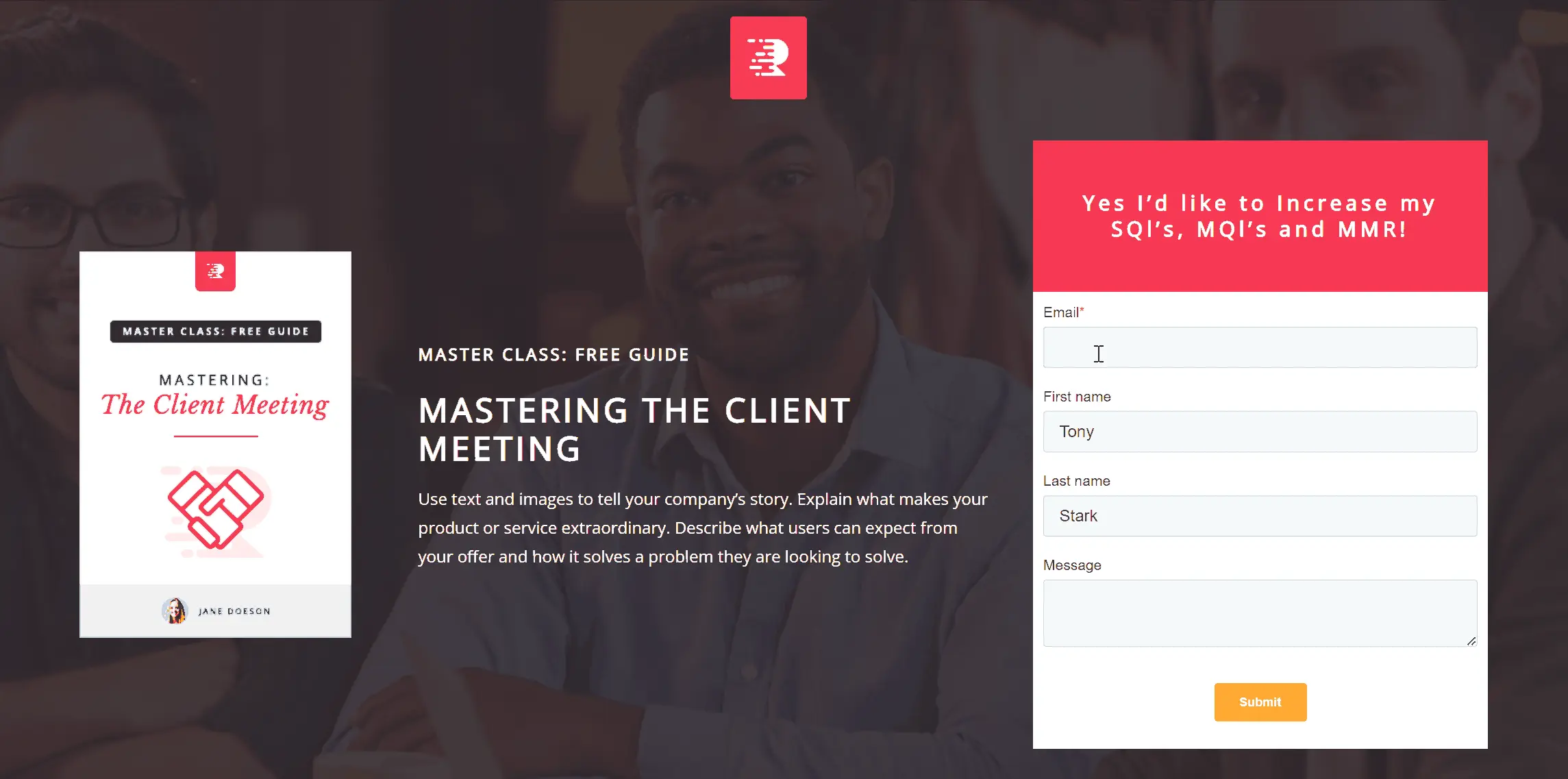
Envision a marketer offering a free eBook on social media strategies. Before downloading, users encounter the lead generation form. Placed strategically on landing pages, these forms might ask for a name, email, or company size. In return? Valuable content awaits – maybe an eBook, a webinar, or a product trial. A fair exchange seals the bond between the user and the business.

👉 Check Out These Website Form Examples That Offer Great UX

Key Elements to Keep in Mind for Form Design


Every time you design a form, you're essentially crafting a conversation between your brand and the user. Just like any productive dialogue, this, too, should be smooth, straightforward, and without unnecessary jargon or barriers. Here's your cheat sheet for designing forms that work.

1. Title


Your form's title is its headline, the first thing users will see. Make it clear and direct, answering the fundamental question: “What is this form about?” If users can't immediately discern the form's purpose from its title, chances are they'll abandon it.

Imagine a title like “Sign Up Here” versus “Join Our Fitness Revolution!” The latter not only informs but also excites the user.

2. Sub Headings


Subheadings provide context. While the title grabs attention, subheadings guide users through the form design. Use them to break up sections in longer forms or to offer brief instructions. For instance, under "Personal Details," you might add a subheading: "We promise to keep these private."

3. Form Fields


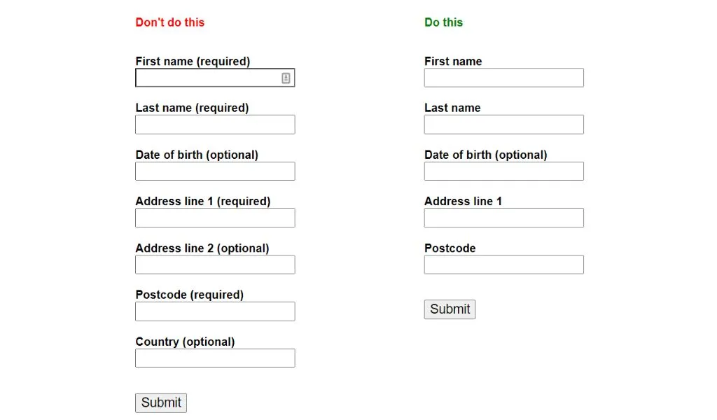
Less is often more. Every additional field can be a barrier to form completion. Prioritize what's essential. Name, email, and password might be non-negotiable for a signup form design, but is the user’s birthdate really necessary?

Ensure that each field serves a purpose. Additionally, labels should be clear and positioned effectively to avoid confusion.

Designing form fields for better form design

4. Form Validation


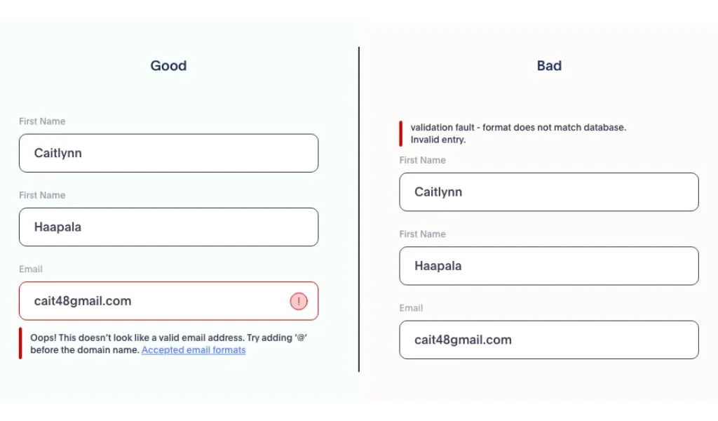
Users will make mistakes, but how you handle those mistakes makes all the difference. Real-time form validation, which immediately informs users if they've entered invalid data (like an incorrect email format), can significantly enhance user experience.

Use clear, friendly error messages. Instead of a cold "Invalid Input," try "Oops! Looks like you missed the '@' in your email."

form validation for quality leads

5. CTA (Call to Action)


The CTA button is the form's crescendo, the final step in the user's journey on your form design. Make it stand out but ensure it aligns with your form's purpose. Ambiguous CTAs like "Submit" can be less effective than more descriptive ones like "Get Started" or "Join Now." Always assure the user that their effort in filling out the form design will result in tangible value.

6. Confirmation Message or Thank You Page


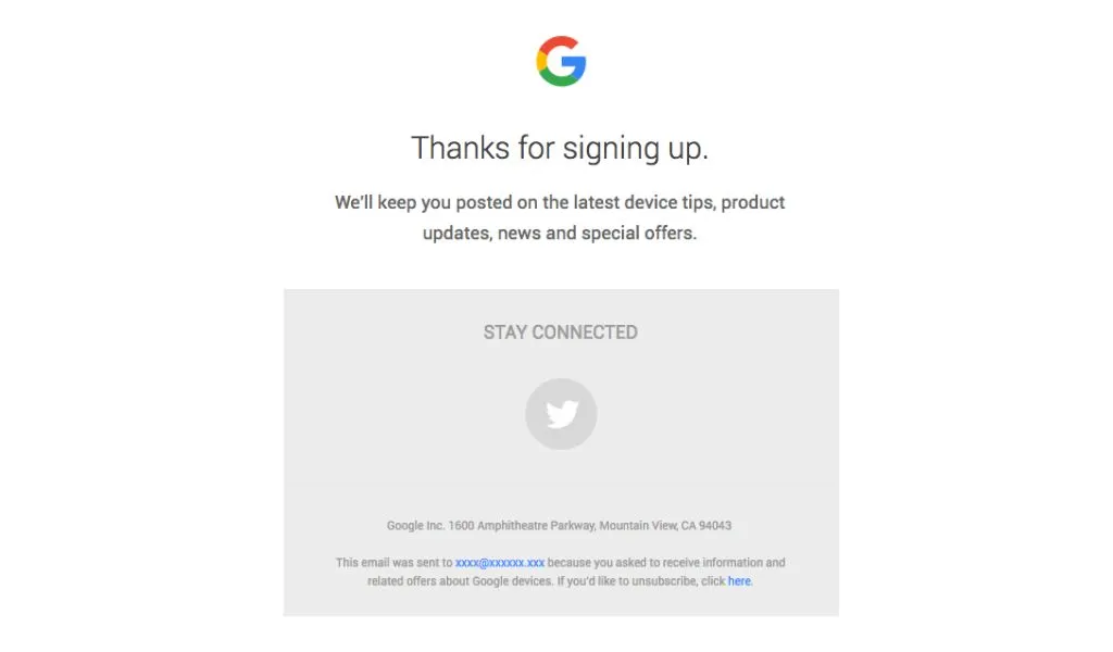
A user has just shared their information, trusting your platform. Acknowledge it. Whether it's a simple "Thank you for signing up!" message or a more detailed confirmation page outlining the next steps, this element brings closure to the form-filling process. It assures users that their action was successful and sets the tone for future interactions.

Designing forms with thankyou message

12 Best Practices to Keep in Mind While Designing Forms


Navigating the realm of form design might feel like trekking through a maze—every turn crucial, every decision impacting the end result. But what if you had a map? A set of best practices, tried and tested, can be that guide.

Let's dive into the golden rules of form designing to ensure your forms are functional, user-friendly, and conversion-focused.

1. Prioritize Essentials


Reducing the number of form fields from around 11 to 4 can increase conversions. Less truly is more when it comes to form fields. Before cluttering your form design with numerous fields, evaluate their importance. Do you really need their middle name? Or their second email?

Remember, each added field could deter a potential converter. If it’s not vital for the immediate task, reconsider its inclusion.

2. Timely Information Requests


Asking users for sensitive info (like credit card details) too soon, especially during a free trial signup, can raise red flags. Request details only when truly relevant.

3. Use Real-time Email Verification


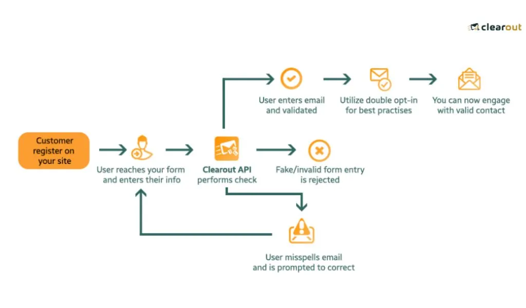
Imagine this: you've crafted a compelling newsletter, but it bounces because users mistyped their email addresses. By verifying emails in real-time, you ensure the captured emails are genuine, paving the way for a high-quality database and an engaged email list. Plus, it helps users correct mistakes instantly, enhancing their experience.

Form design using real-time email verification

✨Try Clearout Real-Time Email Verification For Free. Signup Now!

4. Responsive Design


Ensure your forms are mobile-friendly. With a significant chunk of users accessing sites via mobile devices, a form design that isn’t responsive can be a major turn-off. Ensure usability on smaller screens. Try considering webflow maintenance for enterprises which can provide advanced solutions tailored for mobile responsiveness.

5. Embed Trust Indicators


Users can abandon a website if they suspect it to be insecure. Users want assurance. Including security badges, testimonials, or third-party certifications can elevate the trust factor. If you're collecting payment information, icons of trusted payment gateways can offer users the comfort they seek.

6. Keep it Skim-Friendly


Users skim through most content; they don't read. Highlight the form's objective prominently and use design elements to distinguish various sections. A title like "Join Our Book Club!" is more welcoming than a bland "Fill Form."

7. Reduce Cognitive Load with Familiar Patterns


Using familiar form patterns and sequences (like having "First Name" before "Last Name") reduces the mental effort users need to process the form, making the completion process more intuitive.

8. Employ Smart Defaults


Facilitate quick form completion by using smart defaults. It can reduce the time it takes to complete a form by up to 50%. For instance, if you're catering mainly to a U.S. audience, set the country dropdown to "United States" by default. This isn’t about assumptions; it's about playing the odds for efficiency.

9. Break It Down


A study found that using progress bars in multi-step forms can increase conversions by 28%. Staring at a long form can be daunting. If the form design is extensive, break it into manageable steps. Guide the user through with visual cues, like progress bars or step numbers. It transforms a tedious task into a manageable journey.

10. Use Descriptive CTAs


Instead of generic terms like "Submit" or "Send," use action-oriented and descriptive CTAs like "Get My E-book," "Join Now," or "Send Message." It not only clarifies the action but also makes it more enticing.

11. Always A/B Split Test


Your audience is unique. A design working for one website might not resonate with your users. Split testing allows you to fine-tune your form design based on real user behavior. Maybe your audience prefers a green CTA button over a red one. Only testing will tell.

12. Fortify Against Spam Submissions


Spam submissions can disrupt your analytics, waste resources, and even pose security risks. One effective approach to prevent this is to deploy CAPTCHAs or honeypots, which are designed to identify and block bots while letting genuine users through.

Additionally, regular monitoring and adjusting your form's defenses are key to staying ahead of evolving spam tactics.

👉 Learn More About Preventing Spam Form Submissions

5 Form Design Mistakes to Avoid


In the quest to craft the perfect form, even seasoned designers can sometimes stumble. While we've delved into the best practices, it's equally crucial to recognize and sidestep the common traps that can deter users and diminish conversions. Let's dive into the top five mistakes to avoid in form design.

1. Overloading with Fields


The enthusiasm to know your audience is understandable, but overwhelming them with too many fields can be counterproductive. Forms with fewer fields have higher conversion rates. The key? Ask only what’s absolutely necessary.

2. Ambiguous Error Messages


Nothing frustrates a user more than an error message that doesn’t specify what went wrong. "Invalid input" isn't as helpful as "Please enter a valid email address." Clearly guide your users to the mistake and make the correction process intuitive.

Designing forms with error message

3. Neglecting Mobile Users


We're in a mobile-first world. If your form isn’t optimized for mobile, you’re shutting out a large chunk of potential conversions. Mobile forms require special considerations like touch-friendly buttons, readable font sizes, and ensuring keyboard types match input requirements (like numerical keyboards for phone numbers).

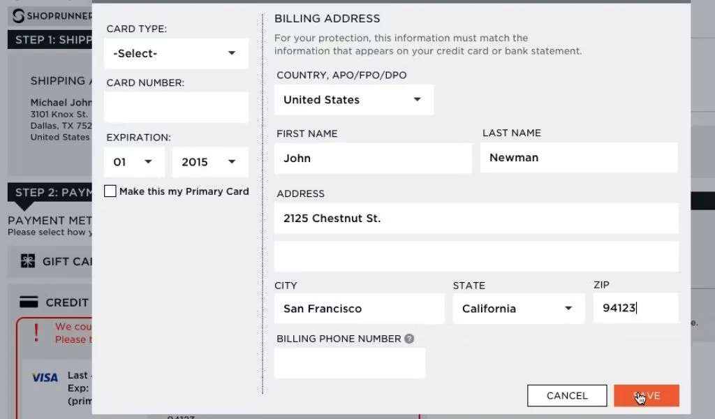
4. Overloading with Multiple Columns


A common misconception is that incorporating multiple columns in a form can save space and make it appear more compact. However, this can disrupt a user's natural reading flow. Most users are accustomed to reading from left to right and then from top to bottom.

When presented with multi-column forms, they may get confused about the sequence of input fields. This can lead to skipped sections or even errors in data entry. For a seamless user experience, it's advisable to stick to a single-column format, ensuring that users can swiftly and accurately move from one field to the next.

Form design mistake of using multiple form columns

5. Overuse of Mandatory Fields


While it's understandable that businesses want to gather as much information as possible from users, bombarding them with numerous mandatory fields can be counterproductive. A form filled with asterisks and "required" labels can seem daunting and may deter users from completing the form.

Only ask for essential information that's crucial to the process. If there are fields that would be 'nice to have' but aren't strictly necessary, consider marking them as optional. This gives users a sense of control and makes the process feel less demanding.

Crafting The Conversion Catalyst: Mastering Form Design


Forms aren't just fields; they're your brand's conversation starters. Done right, they boost conversions and guarantee data accuracy. Besides, it also mandates accuracy and trustworthiness in the data you collect.

Clearout’s real-time email verification ensures that every email entered into your forms is genuine. This significantly cuts down your bounce rates and maximizes the efficacy of your email campaigns.

By integrating Clearout into your form design process, you can enhance user experience through seamless validation and fortify the reliability of your lead generation. It acts as the critical guardian, ensuring each form submission adds tangible value to your business.

Try Clearout Now - For FREE!

Share this article

Recent Posts

07 May 2025
Email Blast 2025: Best Bulk Email Sending Practices that work

Sending bulk emails in 2025? Learn best email blast practices with dos & don'ts to ensure your bulk ...

05 May 2025
13 Top Skrapp.io Alternatives Recommended in 2025

Looking for the best Skrapp.io alternatives in 2025? Explore this handpicked list of 13 tools to rea ...

29 Apr 2025
How To Check and Fix Email IP Reputation (2025 Guide)

Bad IP reputation harming your email campaigns? Read this complete guide on how to check & maintain ...

15 Apr 2025
Cold LinkedIn Messages Getting Ignored? Do this instead…

Are your cold LinkedIn messages not getting replied to? Here's what you should do instead for better ...

10 Apr 2025
20 Best Cold Email Software & Tools of 2025

Looking for the best cold email software & tools of 2025? Find the perfect tool for all your needs t ...

Prospecting ,Email Finder & Email Verification Service

Prospecting ,Email Finder & Email Verification Service


Expand your reach by discovering and verifying the ideal prospects.

Sign up & get 100 free credits | No Credit Card required

Company

Why Clearout?

Pricing

Contact Us

Careers

Enterprise

Sitemap

FAQ

Products

Email Verifier

Email Finder

Prospect

LinkedIn Email Finder

Reverse Lookup

Google Sheets Add-on

WordPress Plugin

ClearoutPhone

What's New?

Resources

Integrations

HubSpot

Team Account

API

Compare Email Verifier

Compare Prospecting

Use Cases

Blog

Help

Legal

Privacy Policy

Terms

DPA

Security

Trust Center

Certification

ISO 27001/2013

SOC 2 Type 2

GDPR

Partnership

HubSpot Certified

Affiliates

Partners

Clearout for browser

⚡ Supercharge Your Prospect Research with Clearout's LinkedIn Chrome Extension - Find and Verify Emails with Confidence!

Clearout Chrome extension

clearout
© 2025 Clearout. All Rights Reserved. Powered by Clearout, LLC.
✨ New! Connect Kit to Clearout and verify subscribers with 99%+ accuracy. Try Now>>
X